
Crypto Bubbles: How to Read a Crypto Bubble Chart
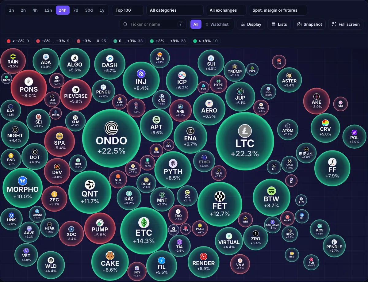
A crypto bubble chart draws every coin as a circle. The bigger the circle, the bigger the price move over the timeframe you picked. Green means the price went up, red means it went down, and the stronger the colour, the stronger the move. One glance shows whether the whole market is rising, which coins lead it and which ones fall against the tide.
The market right now
Most of the chart is green today: a broad move, not a handful of coins pulling the average. Over the last week 60 of the top 100 did better than Bitcoin's +9.6%.
How to read a bubble
Every bubble carries four pieces of information.
- Size is the absolute move over the timeframe by default: a coin that fell 9% is as big as one that rose 9%. You can switch size to market cap or 24-hour volume.
- Colour is the direction. Green is up, red is down, grey is flat.
- Colour strength is the size of the move compared with what is normal for that timeframe. A 3% hour is a lot; a 3% month is quiet. The scale adapts, so a pale bubble on the 30-day view and a pale one on the 1-hour view both mean “a small move for this period”.
- Text is the ticker and, by default, the % change. It can show price, market cap or rank instead.
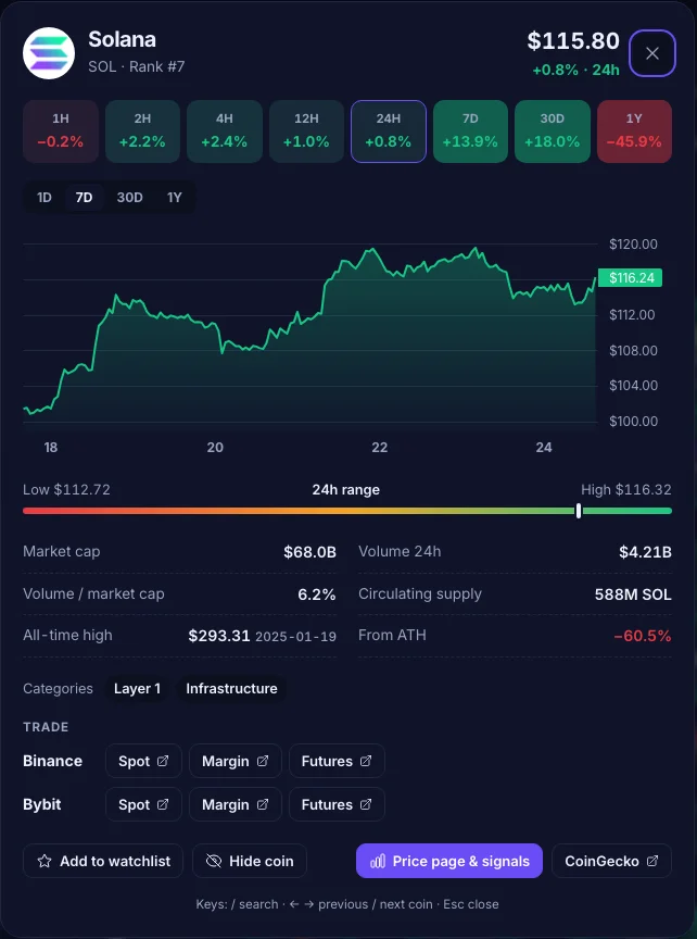
Click a bubble to open its card: price, the change on every timeframe from 1 hour to 1 year, a chart, the 24-hour range, market cap, supply, distance from the all-time high and links to the Binance and Bybit markets where the coin trades.
Choosing the timeframe
The same market looks very different on 1 hour and on 30 days. Short windows show noise; long windows show which moves held. The table uses the live top 100 to show how big a “normal” move is on each timeframe (median and average size of a move), where the strongest colour band starts and how many coins are in it.
| Timeframe | Median | Avg move | Top band | Coins |
|---|---|---|---|---|
| 1 hour | −0.7% | 1.0% | ±2.5% | 7 |
| 24 hours | +2.1% | 4.0% | ±8% | 10 |
| 7 days | +13.3% | 18.8% | ±15% | 47 |
| 30 days | +14.5% | 35.7% | ±30% | 31 |
- 1 hour: something is happening right now. Good for spotting a sudden pump or dump; useless for judging a trend.
- 24 hours: the daily picture and the default. Compare it with Bitcoin to tell a market move from a coin's own story.
- 7 days: separates moves that held from one-day spikes. If a coin is big and green on both 24h and 7d, the move has follow-through.
- 30 days and 1 year: the trend. Expect big numbers: small caps easily double or halve in a month.
Size by move, market cap or volume
% move (the default) answers “what moved the most?”. Every coin gets a fair chance to be big, whatever its size.
Market cap answers “what matters the most?”. The top 10 coins hold 92.4% of the market cap of the top 100, so in this view Bitcoin and Ethereum fill the screen and most altcoins shrink to dots. Use it to see how the heavyweights move, not to hunt for movers.
24h volume answers “where is the money trading?”. A big move on a small volume bubble is easy to push and easy to reverse; a big move on heavy volume has more behind it.
Filter to what you can actually trade
A green bubble is not much use if the coin is not listed where you trade. The exchange filter keeps only coins with a USDT, USDC or FDUSD spot pair, spot with margin, or a USDT perpetual on Binance or Bybit.
| Top 100 coins | Binance | Bybit |
|---|---|---|
| Spot | 68 | 74 |
| Spot with margin | 68 | 70 |
| USDT perpetual futures | 78 | 79 |
83 of the top 100 have a perpetual on at least one of the two exchanges, and 13 trade on neither.
Two more filters remove noise. Stablecoins and tokenised treasury funds are always left out. Wrapped, staked and bridged copies (a wrapped bitcoin moves exactly like bitcoin) are hidden by default; turn them back on in Display.
The rank range picks the slice of the market: Top 10, Top 100 or the next hundreds. The range is counted after the filters, so Top 100 always shows a hundred bubbles when that many coins pass. Category narrows the chart to a sector such as AI, layer 1, DeFi or memes.
Watchlist and hidden coins
Star a coin in the chart, the table or its card to add it to your watchlist, then switch the view to Watchlist to see only those bubbles. Coins you never want to see go to the hidden list. A coin is in one list at a time.
Both lists, the timeframe, filters and skin stay in your browser and come back on the next
visit. Lists → Export saves them as a file; Import takes that file back, or any text with
tickers such as BTC, ETH, $SOL, BINANCE:DOGEUSDT.
Common mistakes
- Chasing the biggest bubble. By the time a coin is the largest circle on the 24h view, most of the move is done. Check the 7d chip in its card: a coin up 25% today after a 40% drop this week is recovering, not breaking out.
- Ignoring Bitcoin. When Bitcoin is down 4%, a coin down 2% is doing well. Read every bubble against the market.
- Reading the 1-hour view as a trend. Hourly moves flip constantly; confirm on 24h and 7d.
- Forgetting liquidity. Size the chart by volume once in a while. Thin coins make the biggest bubbles.
- Treating it as a signal. The chart shows the past. It tells you where to look, not what to do.
FAQ
What is a crypto bubble chart?
Does a bigger bubble mean a better coin?
Which timeframe should I use?
Why are stablecoins not shown?
Is a crypto bubble chart a trading signal?
Market data from CoinGecko, Binance and Bybit, refreshed every 10 minutes. Nothing on this page is financial advice.
Open the live crypto bubbles → · Stock bubbles · Gainers & losers